When building a new house, you have many decisions to make. Decisions like what style the home will be to the color of the window frames and everything in between. Your builder wants to know “yesterday” what hardware, flooring, lighting, paint colors, and (literally) which kitchen sink you want. Because there are so many choices out there, making a decision can be daunting.
You’re busy with career and family and now you’ve added
construction to your to-do list! Don’t get me wrong, it’s also exciting but you’re
starting to feel the pressure of making sure it all goes together. You know
your style and now you need to choose the details.
You definitely want to get it right so you don’t have to do it again. Getting help by investing in interior design services makes so much sense. Your designer can help you with advice and even take much of the decision making off your plate by asking you the right questions about your likes, dislikes, lifestyle, and more.
The architecture of your home will decide much of the design style. You don’t have to stick to one style, though. You can mix design styles. What you need to know is which elements of each style are similar and will help create balance and harmony in your design.
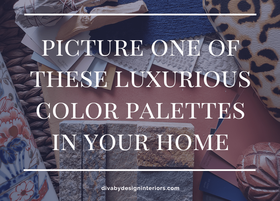
If you’re stuck on what colors you want in your home, here are five color palette inspirations based on the Sherwin Williams Colormix Forecast for 2020.
MANTRA
The first home color palette is a mix of East and West. Soft, muted neutrals in tones of blush, misty green, silvery gray, and celestial blue are all represented here. This palette has both cool and warm tones that will create a soothing and ethereal feeling in your home. It’s a simple palette with understated elegance inspired by minimalism, serenity, and a sense of sanctuary.

SW 6039 Poised Taupe, SW 6031 Glamour, SW 6008 Individual White, SW 6259 Spatial White
Image by Diva by Design
HEART
The second home color palette is a fusion of transitional style with a boho vibe. Colors and themes that seem like they wouldn’t go together harmonize and lend a more meditative feeling than you might expect. Natural earth tones, pinky corals, and even foggy grays go together in a comforting and introspective way. The inspiration for this palette was Bauhaus and Bohemian styles.

SW 9124 Verde Marron
Image by Diva by Design
ALIVE
This home color palette is a deep, rich palette that combines inky blues, ripe olives, and earthy clay in a simple yet gratifying way. Authenticity and optimism were the inspirations for this palette. You can use these colors in your home to evoke a feeling of renewal and luxury at the same time.

SW 7701 Cavern Clay, SW 9085 Touch of Sand, SW 6052 Sandbank, SW 6054 Canyon Clay
Image by Diva by Design
PLAY
This home color palette is bright and energetic with a sense of youthfulness. It starts with a base of pure white and black and then adds bursts of color that feel lively and fun. Use these colors on your home to create that sense of whimsy you felt as a child. The inspiration for this palette came from escapism, joy, and humor.

Image by Diva by Design
HAVEN
The dark blues, greens, and sandy earth tones in this home color palette feel natural and easy. A more subtle palette, it combines the shades of earth, water, wood, and the sky above. This palette was inspired by the seasons. With this simple color palette, your home will feel calm and connected to nature.

Image by Diva by Design
Don’t you love these home color palettes? If you do, and you feel that you need help pulling them together in your own home, call Diva by Design. We can take these inspiration palettes and create a unique design in your personal style. Everything is done for you from beginning to end.
When you create your design plan before the builder ever breaks ground, your project will move ahead much more smoothly and quickly. Your anxiety level will be lower too. Having a clearly laid out design direction, materials list, and color palette also saves time and money during the building phase. Your builder finishes up your new home and then we install your new furniture and accessories while you sit back and relax without having to worry about making any more decisions.
Many people want a beautifully furnished home, but don’t have time to figure out every small detail. Christina Rodriguez of Diva by Design guides you through the process of creating a perfectly planned, personalized, and pulled together space. This way you can relax stress-free in your fully finished home or office. Let us take care of the details so you don’t have to!
CLICK HERE to contact Diva by Design to talk about your new interior design or decorating project.


What a great way to bring together a look. Looking back at all of them, I lean toward the first one, Mantra.
I love how you did this!
Thank you, Ilse!
Mantra is quiet and serene, but still has color.
What a terrific way to get into a homeowner’s taste so quickly. They are sure to gravitate toward one palette or another.
We all have different tastes. That’s one of the things that makes each design project so interesting and unique!
Beautiful inspiration here! I’m somewhere between Mantra and Haven for myself, but I can see these all working beautifully!
Thank you, Janet! I’m personally partial to Haven for public spaces and Mantra for private.
These palettes are so lovely. I am really in love with the Mantra direction.
Thank you, Lisa! So far that seems to be the favorite.
what an ingenious collection of collections! Love your flatlays -perfect illustrations of your palettes!
Thank you, Jeri!
These flat lays are so beautiful. You have quite the talent for combining colors, patterns, and textures. My favorite is Haven.
Thank you so much, Julie! I appreciate the compliment. It’s my favorite part of design and decorating. One of the contractor’s I work with says I’m like a card dealer with the paint swatches. LOL
What a creative way to share color palettes and material choice thru flat lays. Loved this post! It was very hard to select my fave!
Thank you, Deborah! I enjoyed putting these together. Materials selection for remodels and new build homes is one of my favorite services I provide to clients.