In my last blog post, How to Choose Paint Colors Inspired by Nature, there are four different examples of color palettes. You can use each of the palettes as inspiration for your living room design. You can expand these palettes and use them throughout your entire home. Here’s how to choose a color palette for your living room based on the Sundance palette:
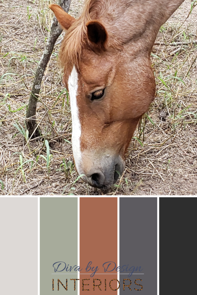
The neutral palette in the image above is based on the coloring of my horse Sundance. It includes color combinations that are gaining in popularity for home design. You can use this palette when you’re tired of looking at your gray walls and need an idea for how to spice things up. Color has a profound affect on how you feel in a space. It can transform the look and feel of a room from cold and sterile to warm and inviting.
Now you have a color palette that speaks to you. How do you make it all come together?
I start with the style of your home and what design style is appropriate for the architecture. Next, I mix design styles for interest and to keep a room or home from feeling like a museum installation. Sometimes you have fixed elements in your home that you aren’t going to change. You can start there as the base of your color palette.

For this Modern Mediterranean style living room design, the Sundance color palette works perfectly. In this living room we mixed Mediterranean, Contemporary, and Mid Century Modern styles.
First we chose our color palette, the second decision was to choose which colors will be for the fixed elements. In this living room, the flooring is a charcoal gray hex tile that is reminiscent of MCM style but in a larger format. In addition, both the white walls and the gray floors come from the color palette.
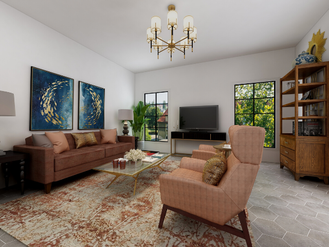
Next, we chose the area rug. It has the earthy clay color from the palette and a lighter version of the gray. We pulled the clay color from the palette and used it for the high-backed armchairs and the throw pillows on both the sofa and the loveseat in the entry.
The buttery leather of the sofa is a darker shade of the clay color. We used the jet black in the TV stand and the side tables. Next, we chose a shimmery gold coffee table with clear glass so that you can see the pattern of the area rug through it. The leopard print of the throw pillows is a luxurious Diva by Design touch that combines the black, gray, white, and orange colors in one velvety fabric.
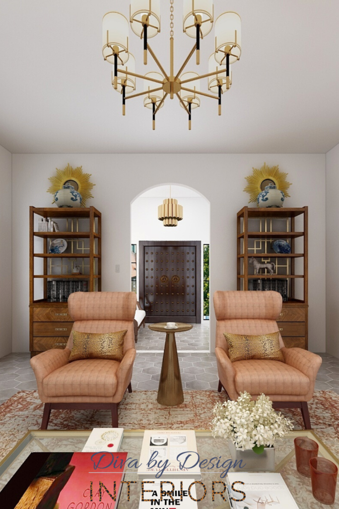
We added the deep blue of the wall art, the plates, and the ginger jars on the bookshelves as an accent color to complement the clay. We added the green to the living room in the tall plants on either side of the sofa.
The white painted walls and the white love seat cushions keep the entry light and bright. There is a little of the clay color in the throw pillow and the gray flooring is the same as the living room to help one room flow into the other. We kept the palette simple to show off the beautiful light fixtures and the solid wood door in the foyer.

You can extend the palette into the rest of the home by using the gray, green, black and clay colors on the walls in other rooms. Then you can mix in the other colors in the fabrics and accessories. In this way, you can take a simple color palette and use it throughout your entire home.
Limiting yourself to a simple color palette will make your home décor decisions easier. When you know what colors you are using, you can rule out anything that isn’t part of that palette. Your home will feel cohesive and each room will harmonize with the next.
If you want help creating a personalized color palette for your home, Diva by Design offers a two hour Design Work Session. Our Materials Selection Service is also available when you want to add the lighting, hardware, and hard surfaces to go with your color palette. Click the service titles to learn more.
We also have more inspiration for home color palettes in our post How to Brighten Your Neutral Home with Color.
Many people want a beautifully furnished home, but don’t have time to figure out every small detail. Christina Rodriguez of Diva by Design guides you through the process of creating a perfectly planned, personalized, and pulled together space. This way you can relax stress-free in your fully finished home or office. Let us take care of the details so you don’t have to!
CLICK HERE to contact Diva by Design to talk about your new interior design or decorating project.
©Diva by Design 2020. All rights Reserved.


Defining a color palette for your home is such an important step to having all the spaces flow well and work together! Terrific example of that principle in action!
Thank you! I appreciate it.
Hi, I am in my moms beach house. Old wall paper and rose wool carpet. I had carpet cleaned and in looks great, my artwork is vast and colorful. I am looking and white walls and white trim, but good grief so many choices. Right now Sherwin Alabaster or Dover white. What do you think?
If you are looking for a white with a yellow undertone either of these will work. Choosing a white paint color (or any paint color) depends on the permanent elements in your space, the light sources, and/or personal preference.
I love how you used your horse, Sundance, as inspiration for a color palette. Defining this is such an important step in the design process!
Thank you!
I love your idea of looking to nature to inspire a color palette. Saving some pins for future inspiration.
Thank you!
I love this step by step and how you translated the digital palette into finishes and materials. I always enjoy getting a peek behind the curtain into how designers think.
Thank you, Jillian! I appreciate it your comment.
I love your style!
I ltove your images Christina! They are exceptionally teachable to implement what your design advises.
Great post!
This is a great breakdown as to how you used an inspirational image to create a beautiful space.
Beautiful color palettes and images!
Loved this post Christina, the photos and color schemes are amazing!
Love your step by step approach, well laid out and great images!