
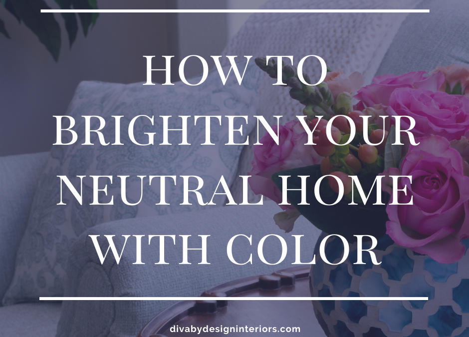
Are you tired of gray ‘everything’ and want to know how to brighten your neutral home? Did you originally use neutrals in your home because you’re afraid of color? Or maybe you think you’ll choose the wrong color and want to paint again next week. These color palettes are a good start for those who are color shy.
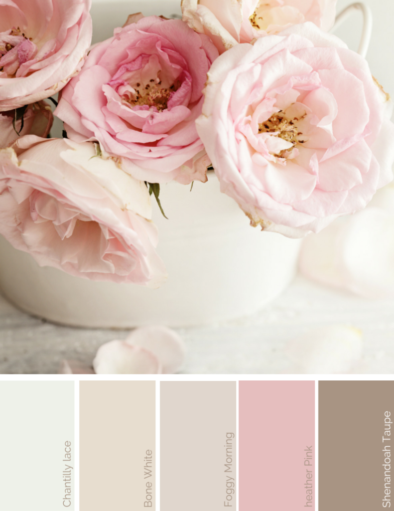
Gray is still popular even though it’s been the main neutral for about ten years now though mushroom is being used more and more. Why? Because it’s brown but it also has gray in it. This is good because you can mix mushroom and taupe with the gray you already have in your home. This adds depth and a feeling of warmth to a room that feels a little cold. It’s still neutral, but with a slight hint of color for those not ready to completely redo everything. Plus, pink looks great with gray!
This color palette works perfectly with Transitional, Cottage, Farmhouse, or “Shabby Chic” design styles. Add antique gold metal finishes to warm it up and give it a classic feel.
How to Brighten Your Neutral Home With Color Palette #1
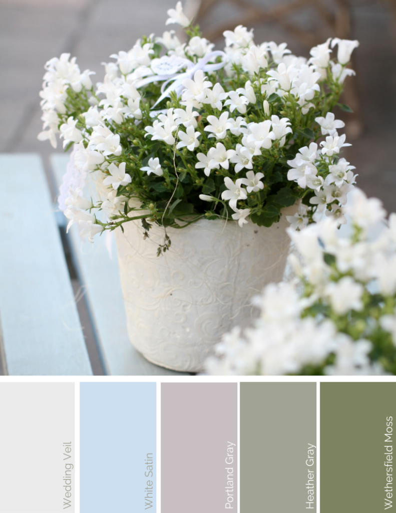
How to Brighten Your Neutral Home with Color Palette #2
The next color palette is still neutral but adds hints of green and blue to bring in nature. Spring is here and the color of the sky and new leaves feels so uplifting and calming at the same time. This combination reminds me of soft Spring rains that make the flowers bloom soon after.
The design styles that this color palette works with are Cottage, Farmhouse, Traditional, and Transitional. Black, gold, or silver hardware can be used with this palette. Black hardware will “ground” your home, Gold will add warmth, and silver feels modern and Contemporary.
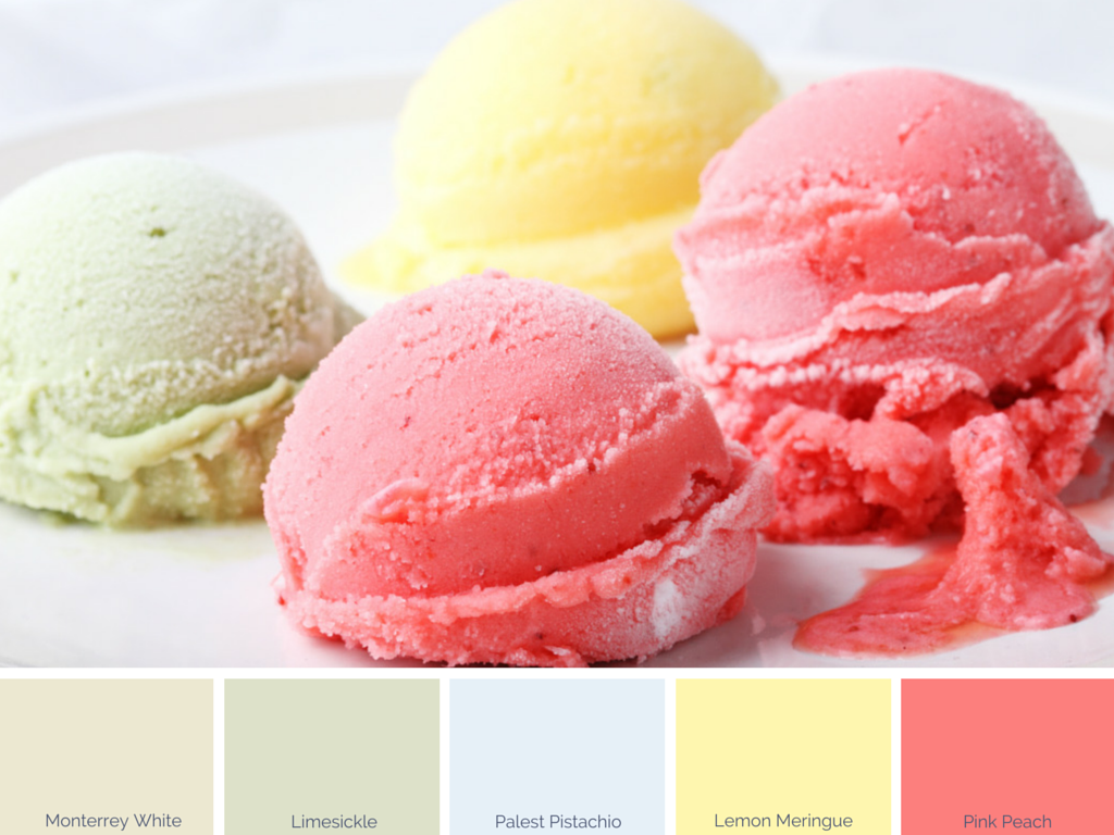
How to Brighten Your Neutral Home with Color Palette #3
If you’re ready to add colors that are a little bolder, this next color palette might whet your appetite. Even the names of the colors sound yummy! We love Blue Bell Pistachio ice cream here at my house. It doesn’t last long in the freezer. And the Monterrey White reminds me of the cone.
These colors would be beautiful in your dining room or to create a bright, cheerful kitchen atmosphere. Brushed nickel or shiny chrome hardware will add to the happy feel when you walk into your kitchen each morning. Cottage style, Traditional, Mid Century Modern, or Transitional style all go with these colors.
How to Brighten Your Neutral Home with Color Palette #4
When you are thinking about how to brighten your neutral home, anything around you can be inspiration for your color palette. Try using the colors that you wear every day. You’re drawn to those colors for a reason. When you surround yourself with the colors you love the most, then you feel connected to your home. You also won’t feel the need to paint so often.
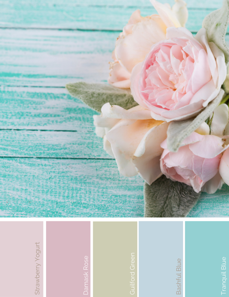
Last, but not least, go a little bolder with this palette of blue, green, and pink. These colors are soft enough not to overwhelm your senses when you’ve been stuck in neutral for so long. If your style is Farmhouse, Cottage, Coastal, Traditional, or Transitional this color palette will create a serene and calm feeling in your bedroom, bathroom, or even your home office. Brushed silver or brass hardware will look beautiful depending on your personal taste.
Adding even a little color here and there in your neutral spaces can lift your mood and change the whole look and feel of your home without having to do a major redecorating project. It can lift your spirits and make you feel ready to face the world again. You take that happy feeling with you when you walk out the front door and your day starts out right.
Don’t be afraid of using color. If you want a simple idea for how to brighten your neutral home with color, I encourage you to try it first in small doses by changing out the pillow covers on your sofa. You might be surprised how you feel after that! And if you need help, click on the link to learn more about (or purchase) our Paint Color Consultation service. We provide both online and in person consultations.
All the colors shown are from the Benjamin Moore Color Preview collection.
Many people want a beautifully furnished home, but don’t have time to figure out every small detail. Christina Rodriguez of Diva by Design guides you through the process of creating a perfectly planned, personalized, and pulled together space. This way you can relax stress-free in your fully finished home or office. Let us take care of the details so you don’t have to!
CLICK HERE to contact Diva by Design to talk about your new interior design or decorating project.
©Diva by Design 2020. All rights Reserved.